

“I can’t do people. I can, however, do colors.”--Julio Torres on The Tonight Show referring to his various hysterical and dead accurate facial impressions of colors.

Julio Torres Impersonates Different Colors and Talks Fantasmas (Extended) | The Tonight Show
Colors communicate so quickly and effortlessly a mood, a desire, an aspiration. In interior design, you are often committing to longer-term decisions about these aforementioned moods with paint, furniture, and upholstery. Making a bold choice and pulling the trigger with larger pieces gives a richness and depth that arrives on impact. But I want it now! Enter the instant gratification solution: you can look at it as thoughtful, accessory curation by adding an injection of color via accessories, florals, and art. Sometimes that’s a more efficient and less expensive way to test drive a look before you go for full color drenching. Trial and error is often how we get to what really feels like “me” and this is the easiest way to the core of the apple!
There must be a better way than just throwing a dart at the color wheel. One of the best ways is to look back at your wardrobe. What do you gravitate toward and keep coming back to time after time? What colors or tones do the designers on your radar favor? If you want to get more esoteric with it, look to art and film. Bonus points for borrowing inspiration for color combos and palettes—I love an ancient tiled floor mosaic (they knew what they were doing!).
Not to be *that* person, but what if we considered our color seasons with our living environments? I’m a firm believer in wearing whatever you want, but what if those choices make us hotter, bring out our eyes? Much like the idea that evenly placed lighting makes you look better (down with overhead lighting). Food for thought!
Architectural Digest recently put out a piece about “Butter Yellow and the Foodification of Color” in design, just as I was questioning what was compelling me to nickname my color crushes food-related names. I very much felt like I was a (self-appointed) recruit for the coveted and mysterious role of a nail polish-namer, but in another dimension. The relationship of fashion and design to food has always been close but is intermingling more than ever now. Food is sexy, it lowers the bar of entry, and further builds out brand worlds–among a host of other reasons.
I wanted to highlight a few colors and their ranges (it’s a spectrum!) that I’m digging for those early fall aches. I created some imaginative moodboards with fun pieces both vintage to contemporary and a range of prices. Maybe you’re about to have yourself an unexpected *insert any color* theory fall!
Salty Taffy
A matured, saltwater taffy blue that you’d buy in one of those shoppy shops or a coastal general store, cornflower and dusty blues. This particular shade of blue feels not too preppy or sweet, but a more nuanced and classical take.
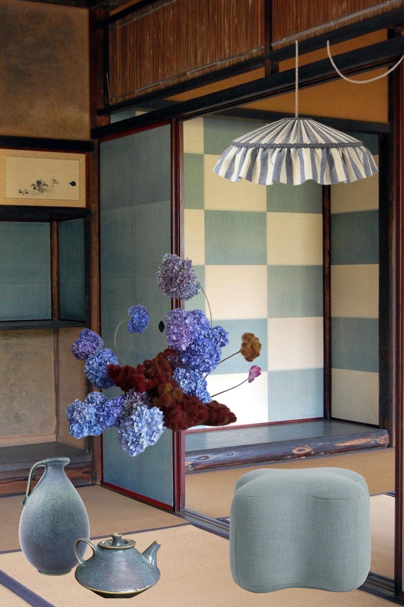
Cornflower blue ruffle lampshade
Bratty Chartreuse
Somewhere between a true chartreuse and a pistachio has been tickling something in my brain. If brat summer transitioned into an autumn on the misty coast of Scotland. With the resurgence of field jackets I’m also appreciating a deeper green with some blue tones.

Chartreuse studio pottery vase
Pure Espresso
From a cool-toned espresso to a super rich ganache to a softer, roasted chestnut that would make for the yummiest suede loafers. Something about these deeper shades of brown feels so enveloping. Maybe because it’s the natural shade of wood and leather but seeing it in paint, textiles, and accessories in this hue—it’s so rich. Not to mention the color drenching we see with the paint in the room below.

Melamine dishes-feels similar to the plate next to the crescent dish, and much more affordable!
Whipped Butter Tower
Butter yellow has been rumbling around in my brain since the Man Repeller days of
and her stick of butter outfit theory. It’s soft, it’s sweet…actually I think it’s chic? From the Row’s 90’s bag to the soft creamy yellow of a rice paper lantern–it has the power to be a neutral. Come to think of it, Rose Uniacke actually has been using the shade in a bolder form for years as a bit of a design calling card. She even made her book jacket yellow.

Le Fleur x Parachute sheet set
Bordeaux Blend
“Burgundy for autumn? Groundbreaking.” Red and its many iterations have been simmering, bubbling over in fashion for the past few seasons. The obviousness of a primary color being “in” is hardly groundbreaking, but it is prevailing. Cooler seasons always bring a deepening of saturation to a hue, and whether it’s the continuation of a cherry red into a mature bordeaux or a tomato red into an oxblood–I like them both. Taylor Swift’s Red→ Maroon pipeline…it’s a phenomenon!

XO,
Jenny
Thank you, Nicole! Agreed, I’d love to see more as well and make it less intimidating to use them.
I’m obsessed with all these colors! My goal this fall is to wear more color so I’m dying to add some accessories in salty taffy and bratty chartreuse to pair back to oxblood and espresso.